Themes, Styles and Custom CSS
Have you ever looked at the layout or your form/application and wonder how you can make it better suit your needs? You can change it! You can make a great many changes by tweaking the CSS of an object.
There are 3 ways to change the look of your application:
- Use the Style/Theme Editor, it enables you to make style changes without the need to understand or write CSS. Click the Style tab, select a theme and then click Customize to change how it looks. Changes will be applied to all forms within the application. This should be the first place you look to make style changes.
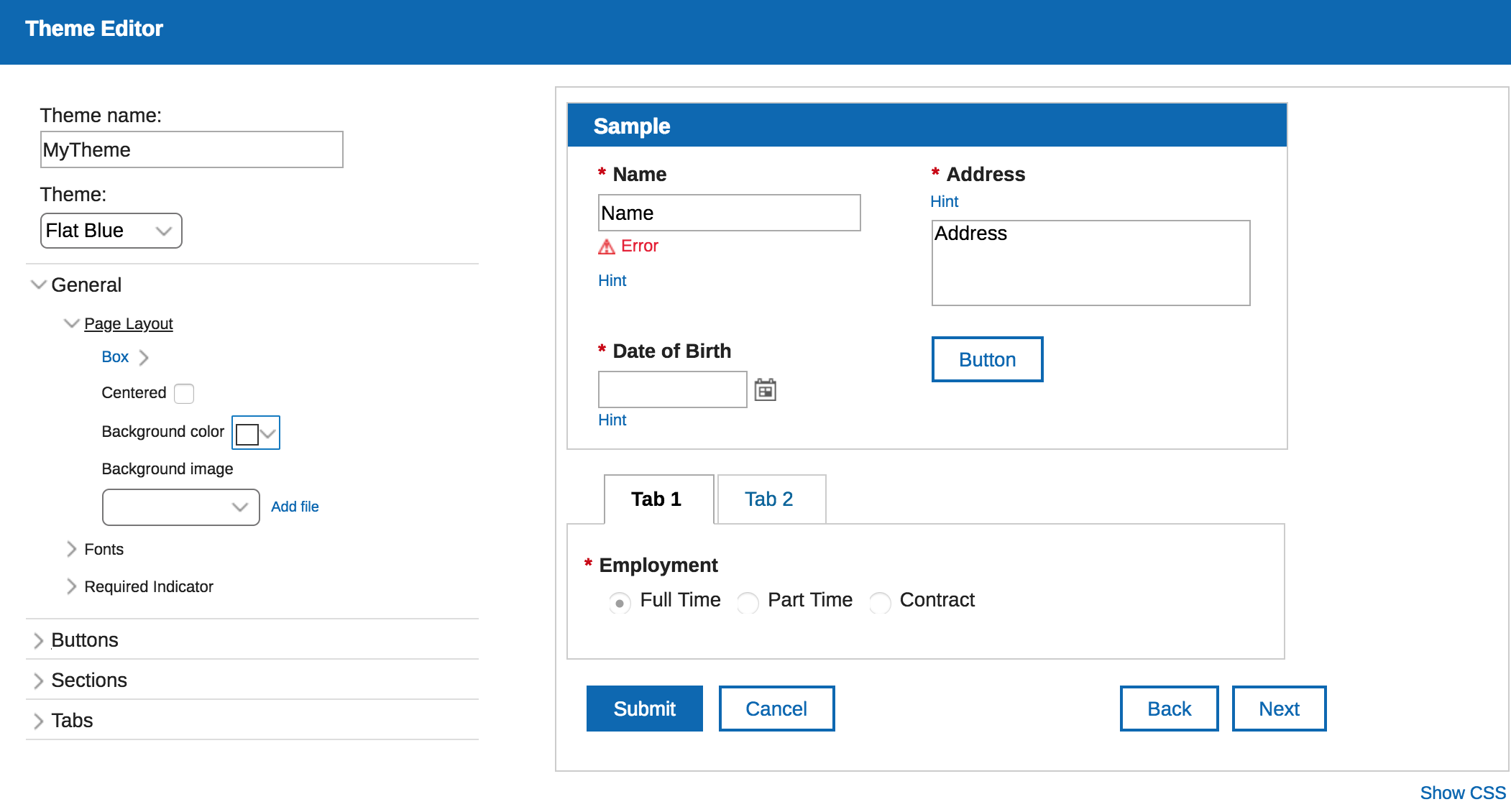
- Add a .css file to the application. Changes will be applied to all forms within the application.You may define any CSS class or override existing classes to completely customize the look of your forms. To add a file, click on the Settings tab, click Files, click the Add button, and select the file (either local or on the internet). Make sure you select the css file in the Custom CSS dropdown on the Style tab, otherwise the styles will not be usable. Note: an application may only have one .css file and it must be selected on the Style tab for the classes to be applied.
You must add the class name to the Custom CSS class names property of any item where you want the style to be applied.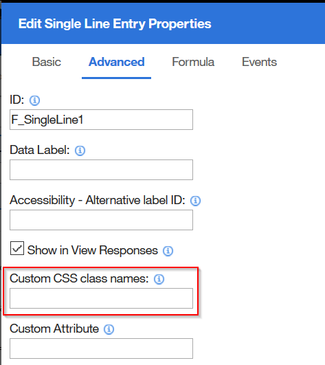
Add an HTML item and define the style directly. This approach will only apply the style to the form where it is defined.
Define style directly within an HTML area<style> .lfMn.lotusui30 .lotusBanner { display:none; } .lfMn.lfSingleFormArea .lfFormTitleBar { display:none; } </style>
This page is dedicated to the types of changes that I have seen and that you might want to use in your own applications. Don't forget to check out our documentation on Creating Custom Styles to better understand how the forms are structured and all of the CSS classes that you may override.
Table of Contents
- Dynamically Change the Background Color of a Field
- Convert Web Link object to look like a button
- Custom Fonts
- Using Text Items for Navigation
- Right Align Number Fields
Dynamically Change the Background Color of a Field
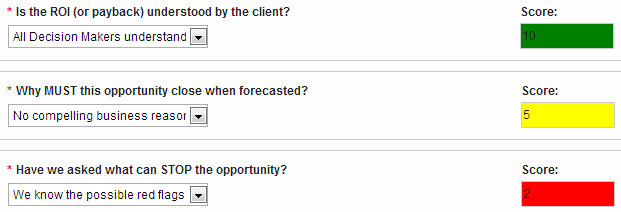
This example uses a few different concepts. We want to change the field background based on user input.
There are few steps:
1. Create a CSS class for each color:
.lfMn.lotusui .lfMScoreFieldRedInActive.lfFormFieldDisabled .dijitTextBox
{
 background: red !important;
}
Let's break this step down. We have to define the right class name otherwise this will not work. .lfMScoreFieldRedInActive is the custom name that we are creating. Because there is no space to lfFormFieldDisabled it means it will be a subclass of that existing class and it will also apply to the dijitTextBox class. The !important will enforce our color over the other definitions.
2. Save the css file in your app and apply the style.
3. Create the conditional logic that applies the appropriate styles at the correct times. For this I wrote a function:
app.getSharedData().applyBackgroundColor = function(theField) {
  var v = theField.getBOAttr().getValue();
  theField.removeClasses(theField.getClasses());

  if(v !== 0 && v > -10 && v < 4) {
    theField.addClasses("lfMScoreFieldRedInActive");
  } else if(v >= 4 && v < 8) {
    theField.addClasses("lfMScoreFieldYellowInActive");
  } else if(v >= 8){
    theField.addClasses("lfMScoreFieldGreenInActive");
  }
}
This will be used in several places to insure the correct style is used. Note that we are first removing all the existing custom classes and then applying the specific one in each circumstance.
4. Then in the onItemChange event of each field we reference the function:
app.getSharedData().applyBackgroundColor(item);
Attached is a sample application that you can download and test.
Convert Web Link object to look like a button
In this example we are going to convert a Web Link object so that it looks like a button.

1. On the Advanced tab of the Web Link object enter "linkButton" as the "Custom CSS Class Name".
2. Copy the following CSS into a file:
.lfMn.lotusui30 .linkButton {
   background: #dadada !important;
   border: none;
   padding: 3px 15px;
   background-color: #e7e7e7;
   background: -moz-linear-gradient(top, #ededed 0%, #e1e1e1 100%);
   background: -webkit-gradient(linear, left top, left bottom, color-stop(0%, #ededed), color-stop(100%, #e1e1e1));
   border-radius: 3px;
   box-shadow: 0 1px 1px rgba(0, 0, 0, 0.5);
   width:65px;
}

.lfMn.lotusui30 .linkButton a {
  text-decoration: none !important;
  border-bottom:none !important;
  color: #000000 !important;
  font-size: 12px !important;
  font-weight: bold !important;
}
Here is an alternate approach:

.lfMn.lotusui30 .linkButton {
    padding: 1px !important;
    text-color: #0B8ABF !important;
    text-align: center !important;
    font-size: 20px !important;
    font-weight: bold !important;
    border-style: solid !important;
    border-color: #0B8ABF !important;
    width: 150px !important;
}

.lfMn .linkButton .static-web-link .linkWrapper {
    float: left;
    line-height: 1.8em;
    width: 100%;  /* Have to set this so that the container spans the whole width of the link object created*/
    margin-right: 2px;
    cursor: pointer;
}

.lfMn .linkButton .static-web-link .linkContainer {
    float: left;
    line-height: 1.8em;
    margin-right: 2px;
    width: 100%; /* Have to set this so that the container spans the whole width of the link object created*/
}
4. Save the file. Go to the Files Tab in your application and add the file.
5. Go to the Style tab and select the added file in the "Customize your theme with additional CSS" dropdown.
6. Save and Preview your application. Your Web Link should appear as a button!
Notes:
- This styling does not resize the button width dynamically with its content, therefore you will have to explicitly set the width. If you do not specify a width then the button "background" will stretch to fill the entire column the Web Link is contained within.
- If you want to change the text color or size, change it in the ".linkButton a" definition.
- If you want to change the background color of the button change it in the ".linkButton" definition.
Change the Background of All Required Fields (including those that might be Read-Only)
The following CSS is broken down into two different class definitions which will override the default classes. These classes apply to singleline, number, currency, date, time, timestamp, email and password fields.
/* Changes the background color of all the fields that are both required AND read-only */

.lfMn.lotusui .lfFormFieldRequired.lfFormFieldDisabled .dijitTextBox { background: #FAFACD !important }

/* Changes the background color of all the fields that are ONLY required */

.lfMn .lfFormFieldRequired .dijitTextBox { background: #FAFACD !important }