Have you ever looked at the layout or your form/application and wonder how you can make it better suit your needs? You can change it! You can make a great many changes by tweaking the CSS of an object.
There are 3 ways to change the look of your application:
- Use the Style/Theme Editor, it enables you to make style changes without the need to understand or write CSS. Click the Style tab, select a theme and then click Customize to change how it looks. Changes will be applied to all forms within the application. This should be the first place you look to make style changes.
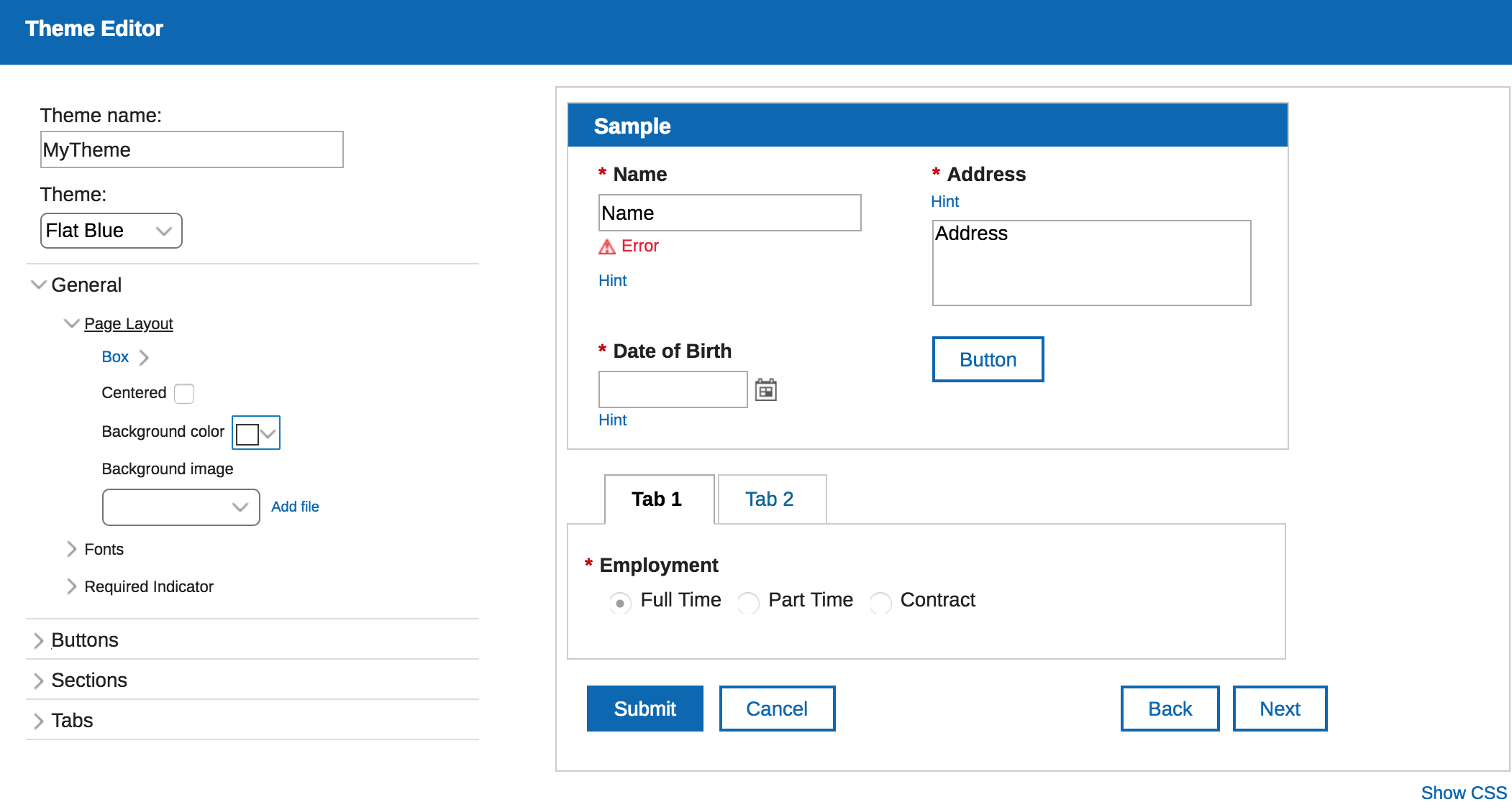
- Add a .css file to the application. Changes will be applied to all forms within the application.You may define any CSS class or override existing classes to completely customize the look of your forms. To add a file, click on the Settings tab, click Files, click the Add button, and select the file (either local or on the internet). Make sure you select the css file in the Custom CSS dropdown on the Style tab, otherwise the styles will not be usable. Note: an application may only have one .css file and it must be selected on the Style tab for the classes to be applied.
You must add the class name to the Custom CSS class names property of any item where you want the style to be applied.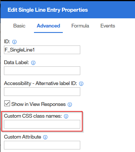
Add an HTML item and define the style directly. This approach will only apply the style to the form where it is defined.
Code Block language js title Define style directly within an HTML area <style> .lfMn.lotusui30 .lotusBanner { display:none; } .lfMn.lfSingleFormArea .lfFormTitleBar { display:none; } </style>
This page is dedicated to the types of changes that I have seen and that you might want to use in your own applications. Don't forget to check out our documentation on Creating Custom Styles to better understand how the forms are structured and all of the CSS classes that you may override.
Table of Contents
- How to reference application-embedded images in your CSS
- Center Checkbox with other fields on the same line
- Center Image
- Dynamically Change the Background Color of a Field295276
- Changing the color of navigation, submit, and cancel buttons
- Change Heading, Tab, and Table Row Color (Center table text)
- Format List Choices into ColumnsMove Labels to the left of the Fields
- Move Labels to the Left of All Fields
- Change The Color of a Field Label
- Convert Web Link object to look like a button
- Custom Fonts
- Hide Banner and Toolbar
- Using Text Items for Navigation
- How to Use Google Fonts
- Right Align Number Fields
- Change Mouse Pointer
...
How to reference application-embedded images in your CSS
You can reference files that you attach to your application (at design-time) in your CSS styles. Let's say that you want use an image to change the background of your form:
...
| Code Block | ||
|---|---|---|
| ||
.lfAppMainArea {
    background-image:url("../image/IBM_Social_Icon.png");
    background-repeat:repeat;
} |
You can see an example of this at -> Linking to Application Files
Center Checkbox with other fields on the same line
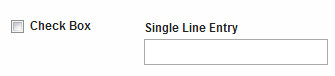
Center Checkbox with other fields on the same lineThe check object by default does not line up center to center with other widgets.
We may use CSS to change the alignment behavior:
Create a css class. You may give it any name you like, but it must be unique from any other classes already used or defined.
Code Block language css .lfCheckCenteredWithField { margin-top: 23px; }- Save this in a file and add it to your application
- Click the Style tab. Select your .css file from the "Customize your theme with additional CSS" dropdown.
- In the Advanced properties of the check item, add "lfCheckCenteredWithField" to the Custom CSS Class names field (without the quotes).
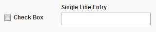
Now we can see that the checkbox is nicely centered with the field!
Note: you could also choose to override the existing checkbox class "lfFormFieldCheckBox", which will apply the change to ALL checkbox items. If you override an existing class you do not need to define the CSS class in the item's properties.
Center Image
This example will give you the capability of centering an image in the viewable window. The CSS is:
1. Create a css class:
| Code Block | ||
|---|---|---|
| ||
.lfMn.lotusui30 .lfCenterImage img
{
    margin-left: auto;
    margin-right: auto;
    display: block;
} |
2. For any image that you add to your form that you want to be centered, set its custom CSS class (on the Advanced tab) to "lfCenterImage".
3. Click the Style tab. Select your .css file from the "Customize your theme with additional CSS" dropdown.
4. Save and Preview the form (in this example one image is centered and the other is not):
other is not):
Dynamically Change the Background Color of a Field
This example uses a few different concepts. We want to change the field background based on user input.
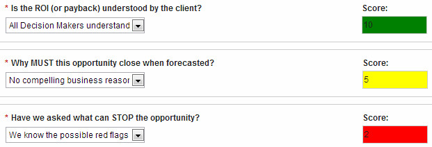
There are few steps:
1. Create a CSS class for each color:
| Code Block | ||
|---|---|---|
| ||
.lfMn.lotusui .lfMScoreFieldRedInActive.lfFormFieldDisabled .dijitTextBox
{
 background: red !important;
} |
Let's break this step down. We have to define the right class name otherwise this will not work. .lfMScoreFieldRedInActive is the custom name that we are creating. Because there is no space to lfFormFieldDisabled it means it will be a subclass of that existing class and it will also apply to the dijitTextBox class. The !important will enforce our color over the other definitions.
2. Save the css file in your app and apply the style.
3. Create the conditional logic that applies the appropriate styles at the correct times. For this I wrote a function:
| Code Block | ||
|---|---|---|
| ||
app.getSharedData().applyBackgroundColor = function(theField) {
  var v = theField.getBOAttr().getValue();
  theField.removeClasses(theField.getClasses());

  if(v !== 0 && v > -10 && v < 4) {
    theField.addClasses("lfMScoreFieldRedInActive");
  } else if(v >= 4 && v < 8) {
    theField.addClasses("lfMScoreFieldYellowInActive");
  } else if(v >= 8){
    theField.addClasses("lfMScoreFieldGreenInActive");
  }
} |
This will be used in several places to insure the correct style is used. Note that we are first removing all the existing custom classes and then applying the specific one in each circumstance.
4. Then in the onItemChange event of each field we reference the function:
| Code Block | ||
|---|---|---|
| ||
app.getSharedData().applyBackgroundColor(item); |
Attached is a sample application that you can download and test.
Changing the color of navigation, submit, and cancel buttons
You can customize the look and color of buttons within your form to better suit your businesses branding. In this example we are changing the background and font color as well as the font size on the button.
1. Create a CSS class. For this example we used BlueButton.css attached below.
2. Breaking down the CSS we started with the Submit button.
| Code Block | ||
|---|---|---|
| ||
.lfMn .lfFormBtn.lfFormActionSubmitBtn {

   font-size: 12px;
   background: #032092;
   border: 1px solid #222;
   font-weight: bold;
}
.lfMn .lfFormBtn.lfFormActionSubmitBtn * {
   font-weight: bold;
   color: white !important;
} |
The submit button has a CSS class name of .lfFormBtn.lfFormActionSubmitBtn. Once you define the class you have standard CSS properties you can update to change the look of the button. Here the font is increased to 12 pixels with a dark blue background and a one pixel border around the button. The font-weight is also changed to bold rather than the normal default. In order to override the font color or force the color we want we need to use color: white !important; If you don't specify !important; the color will not change as you would expect.
3. Breaking down the CSS for the Cancel Button.
| Code Block | ||
|---|---|---|
| ||
/* Button (Cancel) - dark blue background white text. */
.lfMn .lfFormBtn.lfFormActionCancelBtn {
   font-size: 12px;
   background: #032092;
   border: 1px solid #222;
   font-weight: bold;
   color: white !important;
}
/* All cancel button descendents */
.lfMn .lfFormBtn.lfFormActionCancelBtn * {
   font-weight: bold;
   font-size: 12px;
   color: white !important;
} |
You can start seeing a pattern with the naming convention of the buttons with the cancel button still being in the .lfFormBtn parent class with .lfFormActionCancelBtn class for the button itself. The font-size, background color, border, font-weight, and font color are set. To ensure that all the descendants of the cancel button are also overridden with our chosen style we use the * behind the class .lfMn .lfFormBtn.lfFormActionCancelBtn *.
4. Changing the navigation buttons.
| Code Block | ||
|---|---|---|
| ||
.lfMn .lfPageNavigation .lfFormBtn {
   background: #032092 !important;
   border: 1px solid #222;
}
.lfMn .lfPageNavigation .lfFormBtn *,
.lfMn .lfPageNavigation .lfFormBtn *
{
   color: white !important;
   font-size: 12px;
   font-weight: bold;
} |
In order to change the navigation buttons we use the .lfPagenavigation .lfFormBtn class here we set the background color and border. To make sure any navigation button descendant also has the same font-size, color, and weight we use the .lfMn .lfPageNavigation .lfFormBtn *,
size, color, and weight we use the .lfMn .lfPageNavigation .lfFormBtn *,
Change Heading, Tab, and Table Row Color
This example demonstrates how to change the font style and color of a section header as well as tabs. It also shows how to change the color of table rows and center the items within the table.
| Code Block | ||
|---|---|---|
| ||
/* Section - title bar blue background and white text */

.lfMn .lfFormFieldSectionTitle {
   background: #032092 !important;
   color: white !important;
   font-size: 13px !important;
   font-weight: bold !important;
}
.lfMn .lfFormFieldSectionTitle .lfFormLabel {
   color: white !important;
}

/* Tabs - dark-blue background with white text */
.lfMn .lfFormFieldTabFolder .lfFormFieldTab {
   background:  #032092 !important;
   border-top-color:#666;
   border-right-color:#666;
   border-left-color:#666;
}
.lfMn .lfFormFieldTabFolder .lfFormFieldTab * {
   color: white !important;
}

/* Tabs (selected) - white background with black text */
.lfMn .lfFormFieldTabFolder .lfFormFieldTabChecked,
.lfMn.lotusui .lfFormFieldTabFolder .lfFormFieldTabCheckedHover,
.lfMn.lotusui .lfFormFieldTabFolder .lfFormFieldTabCheckedError {
   background: white !important;
   border-top-color:#ccc;
   border-right-color:#ccc;
   border-left-color:#ccc;
}
.lfMn .lfFormFieldTabFolder .lfFormFieldTabChecked * {
   color:  #032092 !important;
}
/* Table dialog title bar center font. */
.lfMn .dojoxGridHeader .dojoxGridCell,
.lfMn .dojoxGridHeader .dojoxGridCell .dojoxGridSortNode {
text-align: center !important;
}
/* Table cells center text */
.lfMn .lfFormFieldTable fieldset .dojoxGrid .dojoxGridCell {
text-align: center;
}
/* Table row color - light grey blue  */
.lfMn.lotusui .dojoxGridRow.dojoxGridRowOdd {
  background: #eaeaec !important;
   border: 1px solid;
   border-color: #EBEADB;
   border-right-color: #D5CDB5;
   padding: 0px 0px 0px 0px;
   text-align: center;
   overflow: hidden;
}
/* Table header row alignment centered */
.lfMn .dojoxGridMasterHeader .dojoxGridMasterView .dojoxGridView{
text-align: center !important;
} |
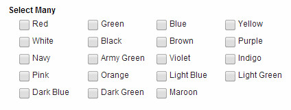
Format List Choices into Columns
This example demonstrates how to change the css class definition of a list so that the choices can be rendered into columns.
Code Block
language css .lfMn .selection-group-item-text-container { width: 6em; } Note: you can also achieve this same result with the following (sets the column width and then establishes a standard padding on the right-side of each option): .lfMn .lfFormField .selection-group .horizontal-selection-group-item { width: 100px; padding-right: 25px !important; }
3. On the Style tab, apply your custom CSS by selecting the uploaded file under the title "Customize your theme with additional CSS".
Note: The column width is hard-coded, so you may need to change it depending on the length of the list choices.
Move Labels to the Left of All Fields
*No longer necessary in 8.6.x* - There is a form level property that you can use to change the label orientation to top, left or right.
The trick to this CSS is making sure you cover all the nuances at different levels (i.e. within panes, tabs and sub panes, etc).
1. Create a css file with the following classes:
| Code Block | ||
|---|---|---|
| ||
/* Move labels to the left of fields */
.lfInline div{
    display: inline;
}

.lfInline div.form-field-title-sign-css label{
    width: 110px !important;
    display: inline-block;
    text-align: right;
}

.lfInline div.form-field-bottom-field-css input{
    max-width: 50% !important;
}

.lfInline td[colspan="3"] div.form-field-bottom-field-css input{
    max-width: 80% !important;
} |
2. Add lfInline to all the fields where you want their label to show to the left of the field.
3. On the Style tab, apply your custom CSS by selecting the uploaded file under the title "Customize your theme with additional CSS".
Change The Color of a Field Label
1. Create a css file using the following class and add it to the Files section of:
.lfMn .redLabel .lfFormLabel {
color: red;
}
2. Add the class name "redLabel" to the field that you want to have a red label.
3. On the Style tab select the css file that was added.
4. Preview the application to verify the change.
Note: If you want to customize this or rename it then change "redLabel" to any name you want.
...
Convert Web Link object to look like a button
In this example we are going to convert a Web Link object so that it looks like a button.
...
- This styling does not resize the button width dynamically with its content, therefore you will have to explicitly set the width. If you do not specify a width then the button "background" will stretch to fill the entire column the Web Link is contained within.
- If you want to change the text color or size, change it in the ".linkButton a" definition.
- If you want to change the background color of the button change it in the ".linkButton" definition.
...
Change the Background of All Required Fields (including those that might be Read-Only)
The following CSS is broken down into two different class definitions which will override the default classes. These classes apply to singleline, number, currency, date, time, timestamp, email and password fields.
| Code Block | ||
|---|---|---|
| ||
/* Changes the background color of all the fields that are both required AND read-only */

.lfMn.lotusui .lfFormFieldRequired.lfFormFieldDisabled .dijitTextBox { background: #FAFACD !important }

/* Changes the background color of all the fields that are ONLY required */

.lfMn .lfFormFieldRequired .dijitTextBox { background: #FAFACD !important } |
...
Disable the Table Sort When Clicking Column Headers
- Copy the following into a file, something like "disableTableSort.css":
...
- Add the file to your app, in Settings...Files.
- Go to the Style tab and select the newly added file in the Custom CSS dropdown.
- Add "noSort" to the "Custom CSS class names" field on the Advanced tab of the table properties dialog.
- Save and Deploy your application.
...
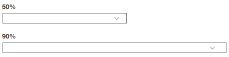
Change the Width of Dropdown Item
...
The following CSS class will set the width of the dropdown item to 90% of its container (cell). The figure can be modified to suit your purpose.
...
| Code Block | ||
|---|---|---|
| ||
.lfMn .dropDown50 select {
  max-width:50% !important;
  width:50% !important;
} |
...
Change the Mouse Pointer
CSS provides several different ways to change the mouse pointer. Check out W3Schools to see all the available cursor styles. A common technique is to change the mouse pointer to the hourglass if a service is executing.
...